|
Sections
 Pie graph Pie graph
Statistics
History
Related articles
The Manager
Settings
Optimize
Quick links
Table of Contents
Questions
|
|
Statistics window
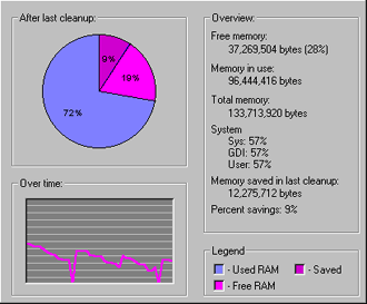
The pie graph
The pie graph shows how much of your memory is currently being used,
how much is free, and how much has been saved directly by MemoryBoost. The
legend shown in the lower right-hand corner of the window indicates what
the different pieces of the pie graph mean. Blue is used memory; pink is
free memory; and the dark pink color is free memory that has been recovered
directly by MemoryBoost.
The statistics (Overview)
The numerical memory statistics are shown in the Overview box. You can see
how much free memory you have, how much is in use, how much is installed on your
computer. MemoryBoost also tracks your System resources, which are special parts
of memory that Windows uses for displaying graphics on the screen, opening files
and other system-level operations. The numbers shown represent the percentage of
System resources that are free.
The history (Over time)
The line graph shows your memory usage over time. Higher values mean that more
memory is free; the Y-axis is free memory (in percent) and the X-axis is time.
|